
5 Ağustos 2026 · Mimari Fotoğraf
Serve:
Ofis Mimari Fotoğrafı
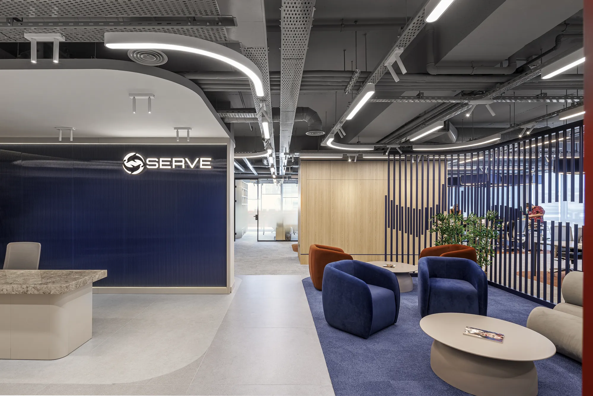
Duman Mimarlık'ın Serve için tasarladığı ofise girdiğinizde sizi önce renk karşılıyor: derin bir lacivert, sıcak bir terrakota ve aralarındaki ahşap. Ama bu çekimin asıl hikâyesi mekânda değil, zamanlamadaydı: ofis tıka basa çalışırken, herkes işinin başındayken fotoğraf çekmek zorundaydık.
Çalışan Bir Ofiste, Molalarda
Bu, boş bir mekân çekimi değildi. Serve tam kapasite çalışırken, telefonlar çalarken, toplantılar sürerken oradaydık. Böyle bir ortamda çekim yapmanın tek yolu, ofisin nefes aldığı anları kollamaktı: öğle yemeği araları ve molalar. O kısa boşluklarda hızlı hareket etmek gerekiyordu. Her kare için ofis yeniden düzenlendi — masalar toparlandı, kablolar gizlendi, mekân kadraja hazır hale getirildi; sonra herkes işine dönünce biz bir sonraki alana geçtik. 5 kişilik ekiple çalışmak tam da burada fark yarattı: biri kadrajı kurarken diğeri bir sonraki alanı hazırlıyor, zaman kaybı en aza iniyordu.
Karşılama: Kimliğin Kurulduğu İlk Kare
Bir ofisin fotoğrafı çoğu zaman karşılama alanında başlar; çünkü mekânın kurumsal kimliği en yoğun burada okunur. Serve'de lacivert bir yüzeye yerleşen marka logosu, açık tonlu zeminin ferahlığı ve ahşap bankonun sıcaklığıyla dengeleniyordu. İlk kararımız, tavandaki lineer aydınlatmanın çizgisini ve zemindeki yumuşak yansımaları korumak oldu. Mekânın kendi ışık ritmi zaten iyi kurgulanmıştı; bizim işimiz onu bozmak değil, kadraja doğru oturtmaktı.
Mevcut Işıkla Çalışmak
İç mekân fotoğrafında en büyük yanılgı, her şeyi flaşla yeniden aydınlatmaya çalışmaktır. Oysa iyi tasarlanmış bir ofiste ışık, mimarinin bir parçasıdır: gömme spotlar, şerit aydınlatmalar, camdan gelen gün ışığı. Serve'de bu katmanları birbiriyle dengelemek için pozlamayı mekânın mevcut düzenine göre kurduk. Amaç, fotoğrafa bakan kişinin "burada nasıl bir ışık var" diye düşünmemesi; sadece mekânı olduğu gibi, davetkâr biçimde hissetmesiydi.
Eğriler, Cam ve Geçişler
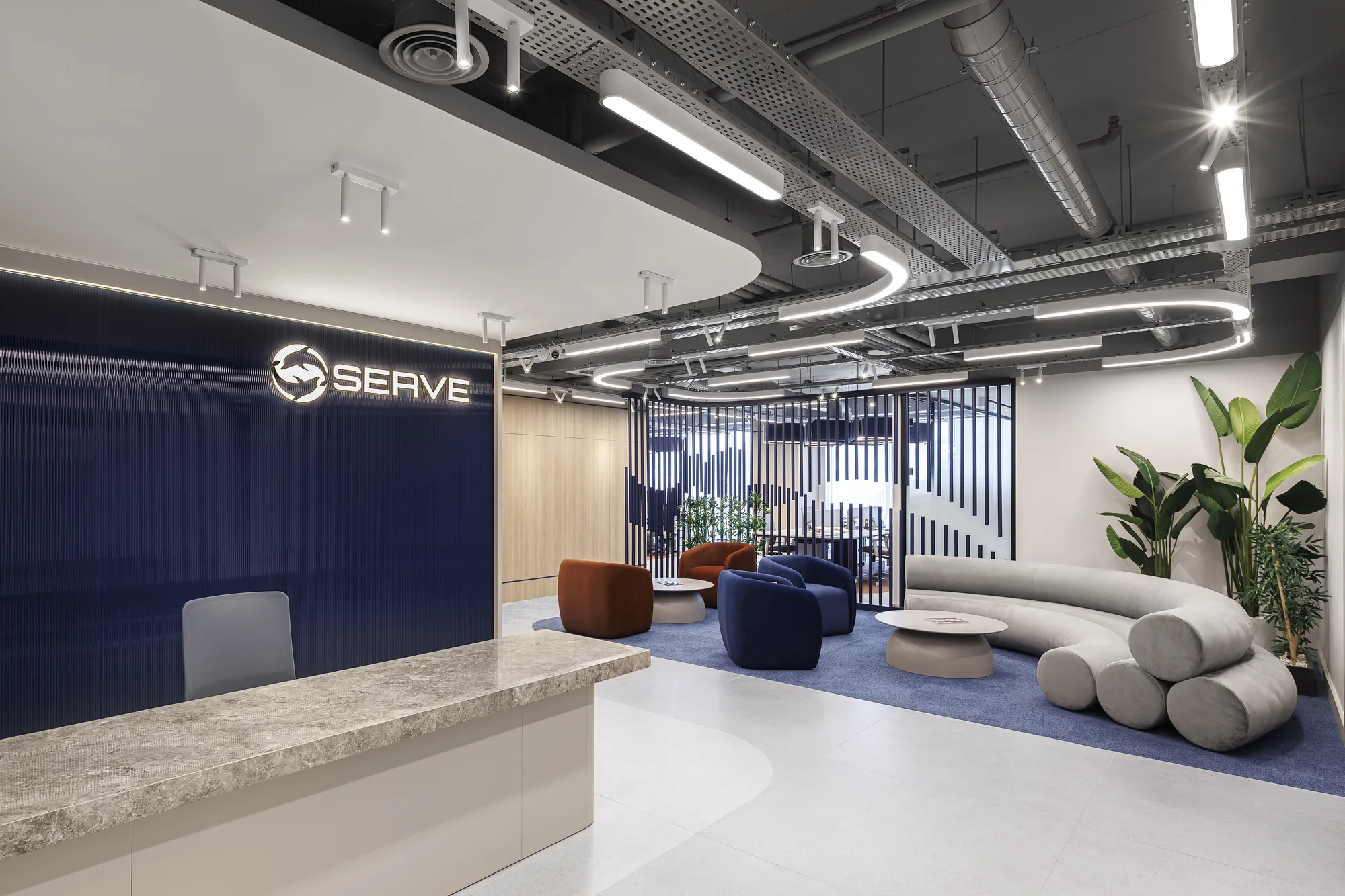
Serve'nin planı düz koridorlar üzerine değil, eğrisel duvarlar ve cam bölmeler üzerine kurulu. Bu, fotoğraf için hem fırsat hem tuzak: perspektif çizgilerini dik tutmazsanız mimarinin geometrisi bükülüyor, mekân olduğundan daha kaotik görünüyor. Açık ofis ile kapalı toplantı hacimleri arasındaki geçişleri kaydederken, her karede dikey çizgileri koruyup derinliği eğrilerin kendisine bıraktık. İkili kareler tam da bu geçiş anlarını yan yana anlatmak için vardı.
Renk: Projenin Taşıyıcısı
Post-prodüksiyonda en çok üzerinde durduğumuz şey renk dengesiydi. Laciverdin kurumsal ciddiyeti kolayca soğuk ve steril bir tona kayabilir; terrakotanın sıcaklığı ise abartıldığında turuncu bir gürültüye dönüşür. İkisini aynı karede tutmak, ahşabın nötr dokusunu köprü olarak kullanmakla mümkün oldu. Sonuçta Serve'nin fotoğrafları, tek bir ofisin değil, bir renk kararının portresi gibi çıktı.
Sonuç
Serve, "sakin ama karakterli" bir kurumsal mekânın nasıl fotoğraflanacağına dair iyi bir örnek oldu. Ne aşırı dramatik bir ışık, ne katalog kuruluğu; sadece mekânın kendi dengesini bulup onu tutarlı bir görsel dile çevirmek. Çalışan bir ofiste, molaların arasına sığdırılan bir çekimden bu kadar dingin karelerin çıkması ise 5 kişilik ekibin uyumuna: birinin bitirdiği yerden diğerinin başlamasına bağlıydı. Bir iç mekân çekiminin başarısı çoğu zaman buradadır — fark edilmeyen kararlarda.
August 5, 2026 · Architectural Photography
Serve:
An Office Built on Colour
Step into the office Duman Architecture designed for Serve and colour greets you first: a deep navy, a warm terracotta, and the timber between them. But the real story of this shoot wasn't in the space — it was in the timing: we had to photograph while the office was working at full capacity, everyone at their desks.
In a Working Office, on the Breaks
This was not an empty-space shoot. We were there while Serve ran at full capacity — phones ringing, meetings in progress. The only way to photograph in such an environment was to watch for the moments when the office breathed: lunch breaks and coffee breaks. In those short gaps we had to move fast. For every frame the office was rearranged — desks tidied, cables hidden, the space made ready for the camera — and once everyone returned to work, we moved on to the next area. A five-person crew made the difference here: while one set up the frame, another prepared the next area, keeping lost time to a minimum.
Reception: The Frame Where Identity Is Set
An office shoot usually begins at the reception, because the corporate identity of a space reads most densely there. At Serve, the brand mark set on a navy surface was balanced by the airiness of the pale flooring and the warmth of the timber desk. Our first decision was to preserve the line of the ceiling's linear lighting and the soft reflections on the floor. The room's own rhythm of light was already well composed; our job was not to break it, but to settle it correctly into the frame.
Working With Existing Light
The greatest mistake in interior photography is trying to re-light everything with flash. In a well-designed office, light is part of the architecture: recessed spots, strip lighting, daylight through glass. At Serve we built the exposure around the space's existing layout to balance these layers. The aim was that the viewer would never wonder "what kind of light is this here" — only feel the space as it is, inviting.
Curves, Glass and Transitions
Serve's plan is built not on straight corridors but on curved walls and glass partitions. For photography this is both an opportunity and a trap: fail to keep the perspective lines vertical and the architecture's geometry bends, making the space look more chaotic than it is. Documenting the transitions between the open office and the enclosed meeting volumes, we kept the verticals true in every frame and left the depth to the curves themselves. The paired frames existed precisely to narrate those transition moments side by side.
Colour: The Load-Bearing Element
In post-production, colour balance was what we dwelled on most. The corporate seriousness of navy can easily slip into a cold, sterile tone; the warmth of terracotta, if overdone, turns into an orange noise. Holding the two in the same frame became possible by using the neutral texture of the timber as a bridge. In the end, Serve's photographs read like the portrait of a colour decision rather than of a single office.
In Closing
Serve was a good example of how to photograph a "calm but characterful" corporate space. Neither over-dramatic light nor catalogue dryness; just finding the space's own balance and translating it into a coherent visual language. That such serene frames came out of a shoot squeezed into the breaks of a working office came down to the coordination of a five-person crew — one picking up exactly where another left off. The success of an interior shoot often lies exactly here: in the decisions that go unnoticed.